Sony Xperia Z Ultra and Z Ultra Google Play Edition review
BY:: Dan Seifert
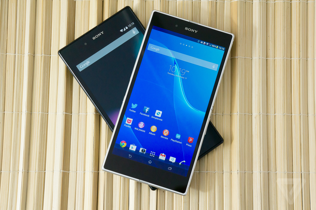
If you’re looking for the biggest smartphone you can get, without regard for portability and price, then you needn’t look any further than the Sony Z Ultra. Available in two flavors, one with Sony’s custom Xperia branding, apps, and services, and another straight from Google with an unmolested version of Android, the Z Ultra is the current reigning champ in the neverending smartphone size wars.
These identical twins, separated at birth and raised by different parents at opposite ends of the world, look similar on the outside and have essentially the same makeup on the inside. But they can’t escape their upbringings, and Sony’s Xperia Z Ultra offers quite a different experience than the Google Play Edition Z Ultra.
We’ve heard this story before: the Google Play Editions of the Samsung Galaxy S4 and HTC One hit the market this past summer, providing a very Google-y counterpart to their manufacturer’s interpretation of Android. But while the normal versions of the Galaxy S4 and One are mainstream smartphones that can be purchased on-contract from every major carrier, the Google Play Editions are only available unlocked, without subsidies, directly from Google itself.
The Z Ultra is a bit different. Either version is a niche product, a 6.4-inch behemoth of a "phone" that isn’t sold by any carrier and can only be ordered unlocked from Sony or Google for $679.99 or $649.99, respectively. These aren’t phones for the mainstream, moms and dads that go into their local carrier stores looking to get the best deal on three lines of service and whatever iPhone or popular Android phone goes with it. Nor are they for the person that just wants a bigger phone — the Samsung Galaxy Note 3 is a better choice for that and can easily be bought in carrier stores. These are for the enthusiast that doesn’t mind paying full retail price for a phone and ordering it warts and all unseen from an internet retailer.
If you’ve already declared yourself part of that niche, and are aware of what you’re getting into when you decide to carry around a phone with a screen larger than virtually anything else out there, which twin do you go with? Sony was responsible for the hardware design decisions and its Xperia software more or less complements them. But Google’s Android is preferred by many over manufacturer skins and interfaces, and the Google Play Edition Z Ultra comes with the most up-to-date Android you can get (along with the understanding that updates will come swiftly).
I’ve spent the past few days with both devices and you might be surprised which one is actually the better smartphone.
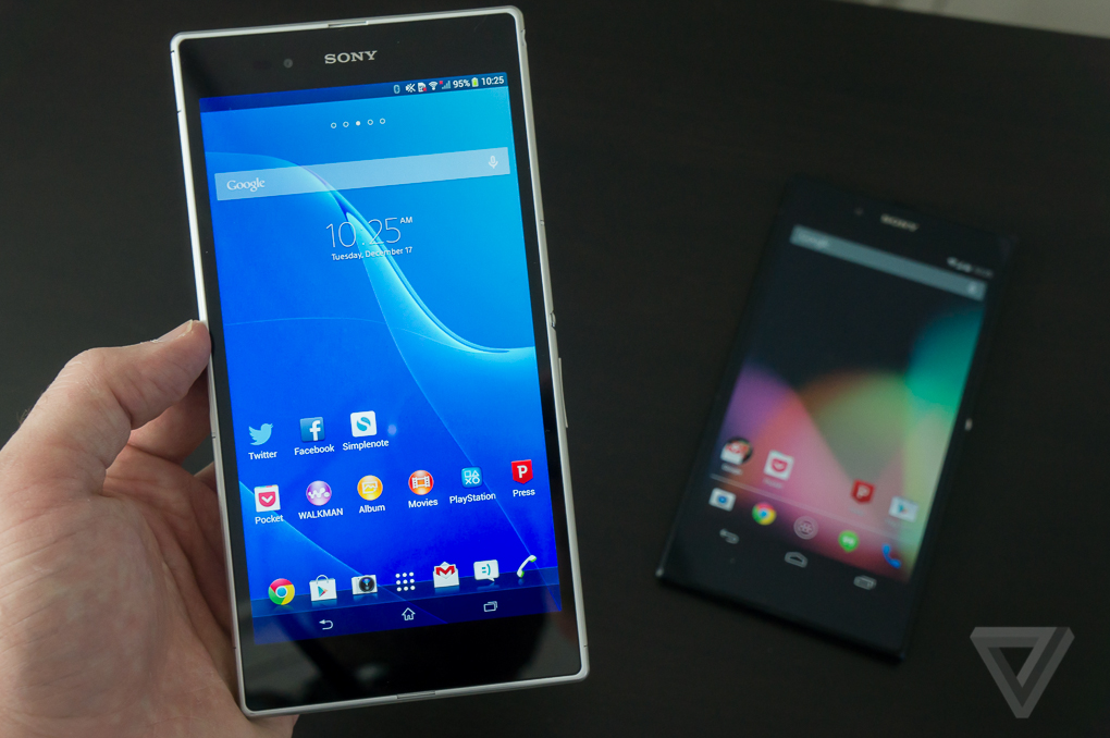
The defining thing about the Z Ultra is its massive size, whether it’s the Xperia version or the Google Play Edition. It’s so big it makes other genuinely big phones, such as the HTC One and Samsung Galaxy S4, look tiny in comparison.
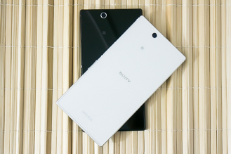
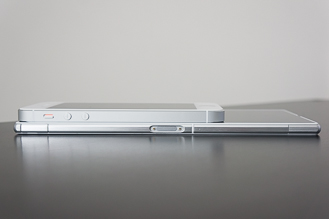
The Z Ultra’s 1080p 6.4-inch display (that’s only 0.6 inches smaller than a bona fide tablet like the Nexus 7, mind you) is pixel dense and bright and doesn’t have the poor viewing angles that other Sony displays exhibit. It’s a pleasant screen to look at whether I am reading books, watching video, or just noodling around on Twitter. But that screen comes at a price: at 7.04 x 3.62 inches in size and nearly 7.5 ounces in weight, the phone is just so incredibly big. Despite the gargantuan proportions, Sony insists on calling the Z Ultra a "phone" and expects you to use it as such. (As you might guess, it’s not very comfortable to talk on.)
I can’t fit either Z Ultra in the front or back pockets of my pants, so I pretty much have to carry it around in my bag or in a jacket pocket. That’s something I’m accustomed to with tablets (and I don’t mind it so much there), but I check my phone on the go far more often than I look at a tablet and it’s annoying to have to dig it out of my bag or jacket to do so. I ended up checking my phone less as a result (which might be a good thing), but I like to be on top of things as possible, and ease of access to my phone is paramount.
The Z Ultra is almost inconceivably thin — at 0.26 inches thick it’s thinner than even the diminutive iPhone 5S. But that doesn’t make it any easier to fit in my pocket and it’s actuallymore awkward and uncomfortable to use. The phone is massive, but there’s actually very little to hold on to when you’re using it, so I frequently touched the screen by mistake when picking it up. It also can be easily flexed — if you do manage to fit it in your pocket, you’re going to want to be careful where and how you sit down.
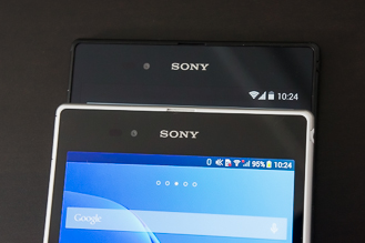
The Xperia version comes in either white, black, or a very Prince-like purple, while the Google Play Edition stays with a conservative black. I like the look of the white model, but the sleek black of my Google Play Edition review unit almost tricks me into thinking the phone is smaller than it actually is. The glass backs pick up my fingerprints pretty easily and are much more slippery than a soft-touch finish, much like the iPhone 4 and 4S. All colors feature silver accents on the power button and camera surround that are similar to Sony’s other recent smartphones. They are also water resistant, so feel free to take them swimming, in the shower, bathing, or whatever else it is you do with a waterproof phone.
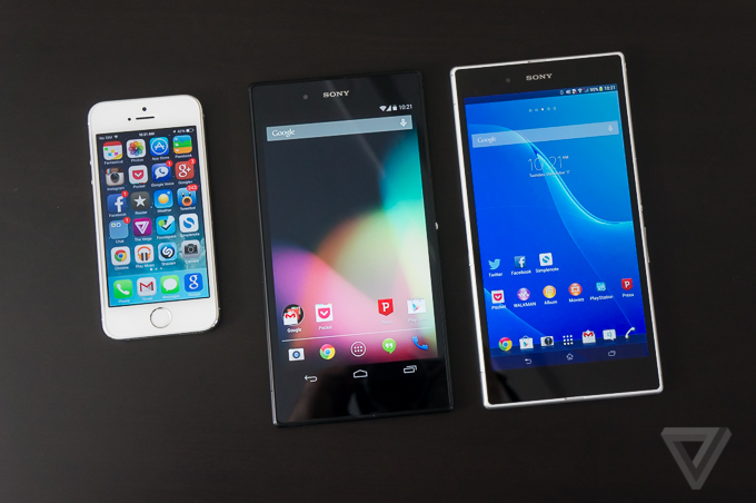
Under its glass-and-metal frame, the Z Ultra is impressive: it has a 2.2GHz Snapdragon 800 processor, 2GB of RAM, 16GB of internal storage with a slot for Micro SD cards, and support for AT&T and T-Mobile’s LTE networks. That’s the same powerful processor used in the Nexus 5 and other recent devices, and it’s just as fast here, regardless of whether it’s pushing around Sony’s or Google’s software. Sony’s 8-megapixel camera is a bit more of a disappointment, however, producing washed-out images with a lot of noise and grain. Both phones have large 3,000mAh batteries, but that big display takes its toll — I only saw battery life of about 14–15 hours from either device. These aren’t multi-day warriors like the Samsung Galaxy Note 3 or LG G2.
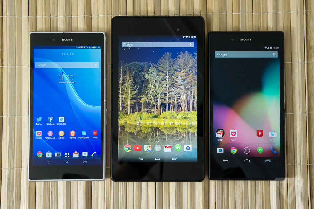
Sony’s version of the Z Ultra, the one that wears the Xperia logo proudly, runs Android 4.2.2 Jelly Bean with Sony’s custom interface and apps. It’s the same interface Sony has used on the Xperia Z and other flagship phones, and it’s got a lot of flashy animations and light textures where standard Android is usually reserved and dark. It’s not an unattractive interface by any means, and it puts the more garish interfaces made by LG and Samsung to shame, but it’s not as stark and utilitarian as Google’s Android.
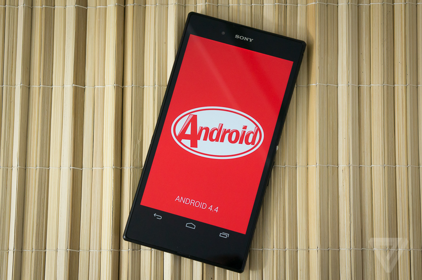
Conversely, the Google Edition of the Z Ultra has no such branding and runs Android 4.4.2 KitKat the way Google intended it, without any added apps or services or features. It’s essentially the same software that Google offers on the Nexus 4 and Nexus 5 (but without the Nexus 5’s exclusive app launcher). It’s a blown-up version of KitKat, but trust me when I say this, it’s the exact same experience, just bigger. Google didn’t really do anything to take advantage of the massive screen real estate offered by the Z Ultra, so all of the apps, menus, settings, toggles, icons, etc. look the same on the Ultra as they do on the Nexus 5. Granted, the text is larger, but you don’t get to see any more information than if you were looking at the Nexus 5’s much smaller 5-inch display.
Sony takes a different approach with its software. Everything is smaller on the Xperia phone compared to the Google Play Edition: the icons, the menu, the status bar, the fonts. It requires me to actually squint to read some things, which is inconvenient and uncomfortable, but it is possible to see more information on the Xperia’s display than on Google’s version. The app icons on the home screen are actually smaller than the app icons on an iPhone 5S, even though the Z Ultra’s screen is 60 percent larger. That doesn’t help you fit any more icons on a page either, since the Z’s app launcher only displays 30 at a time. Still, it feels like a more efficient use of the Ultra’s hardware than the Google Edition.
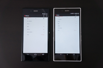
Though the Xperia doesn’t run tablet software, certain apps behave like tablet apps on it and take advantage of its big screen with better layouts and interfaces. Not all apps do this — it seems to be hit or miss when they do (my favorite RSS reader app Press doesn’t, but the Google Play Store and Pocket do, for instance) — but it is nice to see that there is at least some effort made to take advantage of the hardware. Sony doesn’t provide a stylus akin to the Samsung Galaxy Note devices, but it does have an option in its keyboard to convert handwriting to text and you can use any ordinary pen or pencil to write on the Xperia’s display. It’s not the same as the special software offered by the Galaxy Note 3 for stylus work, but it’s a neat little trick.
Sony’s version also has a set of mini apps, such as a calculator, notepad, and others, that "float" on top of other apps for multitasking. It’s a trick we’ve seen before, even on Sony’s own devices, and normally I find the apps to be gimmicky and not very useful. But on the Z Ultra’s expansive display, it almost makes sense to have them. I really wish Sony had included a stylus and optimized software for it on the Ultra, however. This device is just begging for it.
The Xperia model also has a much better camera app than the Google Edition (though neither version takes great photos), a custom power management system, and a few duplicated media apps that Sony jams down your throat when you turn it on, such as Sony’s own Walkman music player and e-book reader. The Xperia also has Sony’s PlayStation Mobile portal, but it’s not much better than Google’s own Play Store for gaming options.
I don’t often say this, but in the case of the Sony Z Ultra, Sony’s interface and software on the Xperia version offer a better experience than the bone-stock Android of the Google Play Edition. The Google Play model may be more up to date with the latest version of Android, and it will likely see updates to the next versions of Android well before the Xperia model. But Sony has committed to updating its devices pretty regularly (it just started shipping Android 4.3 for the international Xperia Z Ultra, and it should soon be available for the US model), and it has a pretty good track record for doing so.
SOURCE:: The Verge
SOURCE:: The Verge


0 comments:
Post a Comment