Check Your Internet Speed

Showing posts with label Technology News. Show all posts

Google Glass: The most personal piece of tech you may never own...

Summary: Some gadgets you can use as though they were your own, like tablets and televisions. But Google Glass, the new kid on the wearable technology block, extends the nature of "personal tech" to a whole new level — even more so than your trusty smartphone sidekick.

By Zack Whittaker


Glass06

I'll start with an admission: my adventure with Google Glass started with simply sheer, unremarkable curiosity
On a cold fall Sunday morning in New York's lower west side, I walked into the world-famous Chelsea Market and made a beeline for an easy-to-miss elevator up to the eighth floor. I was there to collect about $1,600-worth of gadgetry that I knew may never make the light of day in its current incarnation.
For the past few weeks, I have bridged man and machine with Google's latest creation. This wearable technology isn't new, and it isn't exactly original in its design or concept: we've seen it in science fiction for years. But the burgeoning sensation of "what's next" led me to dig deep into my wallet to own something in this brand new and disruptive category of gadgetry.

Inside the glass prism


Unlike a regular set of glasses, Google Glass' micro-display resting above your line of sight takes prime focus. For regular eyeglass wearers, a new pair may feel intrusive and obvious at first but over time feels natural and a part of you.
Wearing Glass is an entirely different feeling. It takes time for Glass to become a natural and logical extension of what you see and how you interact with the physical world in front of you."
Though it's not often someone on the street of Manhattan makes eye contact with you, it's nevertheless an excruciatingly awkward feeling knowing full well you have an unfamiliar and new device on your head. With Glass, I was enveloped with shyness and coyness, and my confidence rapidly melted away.
It was at almost every public-facing moment (and even with the comfort of our own nerdy newsroom) I was always looking in and thinking how silly I looked. But unlike a regular pair of glasses that become a part of you, the exo-perspective of how one looks to others, which many rarely consider, never goes away.
There was a silver lining: Glass quickly begins to negate other behaviors that one, and almost every other smartphone owner in the Western world, suffers almost incessantly.
How many times in a day do you pull out your smartphone to check if you have any messages? A dozen or two — maybe even three? Probably significantly more in fact.
In moments when you're bored, or waiting for someone, to avoid an awkward moment, or to consciously check-in or send your status — it's almost subliminal.
With Glass, it's always there. You're conscious of it at all times. It doesn't slip away or blend in, and it's obscurely addictive. Not only is it always at your beck and call, it's quite literally always on — in your eyesight, in the front of your mind, and physically always pressing gently against your temples where it rests on your head.

The content 'cocoon'

There are two physical sides to Glass: the prism display you see and how others view you. Unlike a smartphone that can be looked on by others, Glass cocoons you in a virtual reality of your own content and communication.
While you're encouraged by the device to speak to it as though it's your head-mounted personal assistant, you aren't forced to "OK Glass" every command. The eyeglass is navigable by tapping and swiping the motion sensor in the device's arm.
There are times when you cannot and must talk to Glass — dictating emails or text messages are the most common example. But one concern never goes away: the personal privacy factor. In spite of the content cocoon you're enclosed in, it isn't watertight because your messages can be audibly heard by others.
The bone-conducting speaker that reads back your messages directly into your head tingles your temple with a subtle but noticeable vibration isn't loud or intrusive — yet it lacks luster in volume, making it difficult to hear callers or read-aloud text above a rabble in a room.
From the outside in, I am just a man on the street talking to himself. It still takes a lot for others looking at Glass wearers to grasp exactly what this device can do. If the device were any smaller or more discreet, any distrust of its capabilities would only deepen.

An extension of your smartphone, it knows (nearly) everything

One of the few things Glass doesn't seem to know is your name. But it knows the more personal things in your life, such as what time you're flying out in the morning back to London for the holiday season.
Glass piggybacks off your Android smartphone or iPhone's data connection when you're out and about, but it has the capability to hop on Wi-Fi networks independently. Regardless of where it gets its connectivity, it gets every shred of data and more through its tethered Google account access. It knows flight times from your email messages, the weather at your location, where's good to eat nearby, and more.
It's not just a logical extension of your smartphone. It is de facto your smartphone.
A smartphone has almost every shred of your data but it rarely sparks a user's surprise. You knowingly put your email, your social networks, and your contacts and other information on your phone. But it often sits in your pocket or rests in your hand when you're actively interacting with it.
I don't remember telling Glass when my flights are, but somewhere along the lines — in e-mail or on a social network — I did, and it knows. We often forget how much information that we store on our smartphones, and Glass is no different.
In fact, Glass has deep Google Now integration that throws up "cards" when it may help. On the morning I wrote this, I knew I had my flight, but like magic it appears with terminal information and live departure status. I walked around the terminal and, behold, a place to grab a coffee and somewhere to buy a slice of cake. It's not beyond the realms of just walking around and killing time, but a week with Glass makes a smartphone feel somewhat archaic.
The fact that this wearable technology sits within plain sight makes interfacing with it feel closer and more interactive. By that, the reality that your data is visual, it's always there, and it's available as and when you want it.
It's an unprecedented visual insight into how much data you actually have stored in the cloud (and what can be done with it) by a company whose product doesn't even know your name — even if you know its. That's a little disconcerting, if not borderline scary in the post-surveillance disclosures world.

There's a reason why eyeglass tech hasn't taken off yet

You've probably seen these wearable glasses before in "Star Wars", or "Star Trek", or something similar.
In fact, "Terminator" is probably a far more realistic example of what Glass is. (Except without the death and the killer robots.)
Put something — or anything — on your face where people can see it and they will stare, even if they've seen it before. It's difficult not to look, frankly, particularly if we're genuinely intrigued and show interest into what something is. It's a learning process, and education cures ignorance.
But we're just not there yet. As smartphones slowly became the norm, so did the privacy situation surrounding plug-in and embedded cameras in devices all shapes and sizes. It took a while for society to adjust — though that process was significantly accelerated when we overcame our concerns and realized we could share our cat photos with the world. Particularly in the Western world, we got there in the end.
Because Glass is so far removed from what we see as natural, society will have a great deal of work to do before we can ethically and culturally overcome this barrier that we are already to some extent part-man, part-machine; the fact we are vastly complemented by technology already notwithstanding.
It's not to say it won't happen. But it will take a long time until we as humans feel safe enough to go outside our collective societal comfort zone.
SOURCE :: ZDnet

CES 2014

The First Apple-Certified iOS Gaming Controllers Need a Power-Up

Logitech's Powershell Controller

Reviewed by : Kif Leswing 

It’s an exciting time to be an iOS gamer. This summer, Apple announced it was going to implement standards for iOS devices to interface with physical controllers, satisfying the demands of gamers who for years have wanted a more console-like way to play iOS games.
Yes, some of the genre’s biggest hits are wedded to the touch interface — Angry BirdsFlight ControlDots — but there’s still a wealth of content that was originally made for consoles. Despite developers’ best attempts, physical controllers remain the ideal way to interface with these iOS ports. Unfortunately, judging from the first two offerings in this burgeoning ecosystem, mobile gamers will have to wait a bit longer for a gaming experience that lives up to the hype.
There are currently only two MFi, or Made for iPhone/iPod/iPad, controllers you can buy: Logitech’s Powershell and Moga’s Ace Power. The former includes four analog right-hand buttons, a D-pad, and two shoulder buttons, as well as a 1800mAh battery, which rounds out the back panel. It’s amazingly solid-feeling, and Logitech got a lot of the small details right. The Lightning connector has a great deal of flex, making it easier to insert and remove the phone. There are also ports for the iPhone’s speakers, so the sound isn't completely muffled by the case. Essentially, in button layout, the Powershell mimics the classic SNES controller design.
Moga’s version, on the other hand, adds two shoulder buttons for a total of four, in addition to two shallow-feeling analog sticks. If the Powershell resembles a SNES controller, Moga’s button-layout is more in line with an Xbox or PS3 controller.
That added flexibility comes at a cost, however. Moga’s sliding design is superfluous at best. The option doesn’t work with the iPhone 4 or 4s — it requires a Lightning connector, remember — so it’s hard to see the point in having a design that can accommodate multiple controller lengths. It also makes the Moga feel absurdly cheap. The analog sticks have no depth, the plastic is incredibly light, and it generally has none of the premium feeling you’d want from a $100 accessory.
Both controllers include a built-in battery, which charges through MicroUSB. This is another annoyance as it requires you to carry around a second cord. Both also feature cryptic lights that are supposed to show you the battery status. Interpreting these blinks is nearly impossible, however, unless you know what you’re looking for. Turning on the external battery only gets you get a few extra hours of juice, and frankly I would have preferred a slimmer form factor.
The good news is that using MFi controllers couldn’t be easier: Take a 5th generation iOS device, either the iPhone or the iPod touch, slot it in, and start playing games. It’s easier than pairing something through Bluetooth, and the integration is admirable.
Moga sent over a iPod touch with six games pre-installed, some of which are paid games and some which were free. Dead Trigger 2, a zombie shoot-em-up, features a pretty intuitive and innovative touch control interface, but playing it with analog joysticks is no comparison. This game needs buttons to really shine. Galaxy on Fire 2 HD, a space shooter, also benefited from physical buttons.
It’s worth noting both of those games require Moga’s controller, and they won’t work with the Logitech Powershell. Despite the Powershell’s superior form factor — which would be perfect for SNES-era ports like Mega Man X or Sonic — I couldn’t find many games that worked with it that I wanted to play. I enjoyed Air Wings, a paper airplane flying game that’s decidedly freemium, but that’s about it.
Which highlights yet another problem: There isn't a section of the App Store dedicated to controller-compatible games. To find compatible titles you have to search for phrases like “controller support.” Additionally, because there’s no standard way to declare controller support, it’s difficult to ascertain whether the game works with a Powershell or needs the extra buttons the Ace Power provides. Any game updated for iOS 7 should have D-pad support, where the buttons are “mapped” to onscreen controls, but even that’s different from native MFi controller support. It’s frustrating and confusing and the entire system is not what you would expect from an Apple-spearheaded initiative.
Yet there are still plenty of reasons to be excited. Playing Grand Theft Auto: San Andreas, offered one of them. The game is the very definition of a console-level title, and it’s fully MFi compatible. Previous GTA ports were fun, but frustrating. It was hard to drive, or bike, or shoot. But Moga’s controller makes that all go away. For a brief hour or two (I lost track), I was simply in the world of San Andreas. It was not until iOS told me my battery was under 20 percent that I remembered I was playing the title on my smartphone.
Ultimately, these MFi-certified controllers suffer from the same problems a lot of first-generation products do. The ecosystem isn’t fully developed, and there are plenty of bugs that still need to be worked out. But with newer controllers on the way from gaming companies like Razer and SteelSeries, there’s no reason to believe this won’t happen. If you were to go with one currently available on the market, I’d opt for the Ace Power because the extra buttons open up a wider range of games to play. Wait 6 months, though, and I’d be willing to bet you’ll get a lot more for your money.

Logitech Powershell

WIRED It’s a much nicer object than the Moga Power Ace. Analog button response is good. Full access to back camera.
TIRED Doesn’t work with iPhone 5c. Needs adapter to work with headphones. The sleep/wake button is tiny and frustrating to use. Not enough buttons for some ports or shooters. Doesn’t work with any cases.


Moga Ace Power

WIRED You can play games, like Grand Theft Auto, like they were meant to be played. Sliding design means you’re not putting pressure on the Lightning connector to insert or remove the handset. Two analog sticks allows it to play first person shooters. Works with the iPhone 5c. Headphones plug in without an adapter.
TIRED It feels incredibly cheap, from the body to the buttons. The sliding design is classic over-engineering. No iPad support.

SOURCE : WIRED

Google and Audi plot new front in Android vs. iOS war.....

Audi R8 sports car design awesome stock 1024

BY :: Rich McCormick


The Wall Street Journal reports that Google and Audi will use the Consumer Electronics Show next week to announce that they are working together to develop Android-based in-car information and entertainment systems. According to sources, these systems are designed to allow drivers and passengers access to apps and services similar to those available on Android-based smartphones and tablets.
The announcement that Google is working directly with a car manufacturer comes seven months after Apple announced iOS in the Car. Where Apple's platform integrates the iPhone into the car's infotainment system to provide access to maps, messages, and other apps, Google and Audi's joint efforts will see Android and Android-based apps run on the car's own hardware.
Both Apple and Google are reportedly attempting to secure support from car manufacturers. Apple's platform already has the support of BMW, Daimler, General Motors, Ferrari, Honda, and Mercedes-Benz. According to EE Times, Audi and Google's announcement at the Las Vegas show will see the formation of an industry consortium, as the companies detail collaborative efforts with other car and technology manufacturers.
Some Audi drivers can already access Google products through their car: the German manufacturer started rolling out Tegra-powered entertainment and information systems in its vehicles in the same year that it demonstrated cars that could navigate through parking lots without a driver behind the wheel.
Ford was a pioneer in the field of in-car infotainment and connectivity systems, installing its Microsoft Sync platform in 10 million cars over the last six years. In February of this year, GM announced that its 2014 models of car and truck would come equipped with LTE service to deliver an "enhanced suite of safety, security, diagnostic and infotainment services." In August, Nokia detailed its Here Auto system, an infotainment platform that it hopes to sell to car manufacturers.
The Wall Street Journal says that Google and Audi will outline a timetable to offer Android-based systems in new models due to arrive over the next four or five years. Details of the collaboratively created systems aren't yet known, but Google's direct influence and quick response to its biggest competitor's move into the automotive field ensure that the car will be the newest battleground for Android and iOS.

Federal judge rules NSA metadata collection is lawful, dismissing ACLU case

federal-courthouse

BY :: Russell Brandom

In a surprise ruling today, a federal judge dismissed the ACLU's lawsuit against the NSA's metadata collection program, closing a major legal avenue for NSA reform. Handing down an unusually sweeping ruling, Judge William Pauley III ruled that the NSA's phone record database was fully lawful under section 215 of the Patriot Act. Beyond that, the judge ruled, "the question of whether that program should be conducted is for the other two coordinate branches of Government to decide."

Judge Pauley opens the opinion with thoughts on the attacks of 9/11, which he describes as "a bold jujitsu." The opening paragraphs detail the case of 9/11 hijacker Khalid al-Mihdhar, who the NSA mistakenly believed was living in Yemen at the time of the attacks because of insufficient data collection. (This anecdote, based on General Alexander's congressional testimony, has been widely disputed.) The metadata collection program grew up in response to those intelligence failures, collecting more and more data so as to suss out the missed connections. Calling the program, "a wide net that could find and islolate gossamer contacts," Pauley concludes, "this blunt tool only works because it collects everything."

One key legal question centered on the status of the documents that revealed the NSA program, which were made public by former NSA contractor Edward Snowden, but are still officially classified. For Pauley, that makes it difficult to build a case on them, or claim damages. "Congress did not intend that targets of 215 orders would ever learn of them," the ruling reads. "It cannot possibly be that lawbreaking conduct by an NSA contractor that reveals state secrets...could frustrate Congress's intent. To hold otherwise would spawn mischief." As a result, he held the ACLU's claim must be dismissed.

It's unclear where the case will go from here, but at least one path leads to the Supreme Court. In a similar case earlier this month, a separate federal court ruled the phone records program was "likely unconstitutional." That disagreement sets the stage for higher level adjudication, although the cases would have to first advance through the necessary appeals. ACLU deputy legal director Jameel Jaffer described the ruling as misguided. "We are extremely disappointed with this decision, which misinterprets the relevant statutes, understates the privacy implications of the government’s surveillance and misapplies a narrow and outdated precedent to read away core constitutional protections," Jaffer said in a prepared statement. "We intend to appeal and look forward to making our case in the Second Circuit."

SOURCE : The Verge , US District Court, Southern District of NY.

NSA reportedly intercepting laptops purchased online to install spy malware.

usb

BY:: T.C. Sottek 

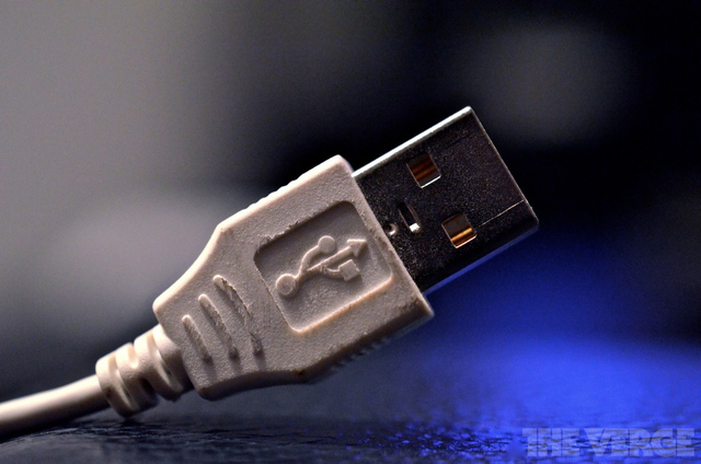
According to a new report from Der Spiegel based on internal NSA documents, the signals intelligence agency's elite hacking unit (TAO) is able to conduct sophisticated wiretaps in ways that make Hollywood fantasy look more like reality. The report indicates that the NSA, in collaboration with the CIA and FBI, routinely and secretly intercepts shipping deliveries for laptops or other computer accessories in order to implant bugs before they reach their destinations. According to Der Spiegel, the NSA's TAO group is able to divert shipping deliveries to its own "secret workshops" in a method called interdiction, where agents load malware onto the electronics or install malicious hardware that can give US intelligence agencies remote access.
While the report does not indicate the scope of the program, or who the NSA is targeting with such wiretaps, it's a unique look at the agency's collaborative efforts with the broader intelligence community to gain hard access to communications equipment. One of the products the NSA appears to use to compromise target electronics is codenamed COTTONMOUTH, and has been available since 2009; it's a USB "hardware implant" that secretly provides the NSA with remote access to the compromised machine.
This tool, among others, is available to NSA agents through what Der Spiegel describes as a mail-order spy catalog. The report indicates that the catalog offers backdoors into the hardware and software of the most prominent technology makers, including Cisco, Juniper Networks, Dell, Seagate, Western Digital, Maxtor, Samsung, and Huawei. Many of the targets are American companies. The report indicates that the NSA can even exploit error reports from Microsoft's Windows operating system; by intercepting the error reports and determining what's wrong with a target's computer, the NSA can then attack it with Trojans or other malware.
In response to Der Spiegel's report, Cisco senior vice president John Stewart wrote that "we are deeply concerned with anything that may impact the integrity of our products or our customers' networks," and that the company does "not work with any government to weaken our products for exploitation." Other US companies have fired back against reports of NSA tampering in recent months, including Microsoft, which labeled the agency an "advanced persistent threat" over its efforts to secretly collect private user data within the internal networks of Google and Yahoo.
The Der Spiegel report, which gives a broad look at TAO operations, also highlights the NSA's cooperation with other intelligence agencies to conduct Hollywood-style raids. Unlike most of the NSA's operations which allow for remote access to targets, Der Spiegelnotes that the TAO's programs often require physical access to targets. To gain physical access, the NSA reportedly works with the CIA and FBI on sensitive missions that sometimes include flying NSA agents on FBI jets to plant wiretaps. "This gets them to their destination at the right time and can help them to disappear again undetected after even as little as a half hour's work," the report notes.
The NSA currently faces pressure from the public, Congress, federal courts, and privacy advocates over its expansive spying programs. Those programs, which include bulk telephone surveillance of American citizens, are said by critics to violate constitutional protections against unreasonable searches, and were uncovered earlier this year by whistleblower Edward Snowden. Beyond the programs that scoop up data on American citizens, Snowden's documents have also given a much closer look at how the spy agency conducts other surveillance operations, including tapping the phones of high-level foreign leaders.

The History of Video Game Consoles: Part One - Everything you wanted to know about the video game consoles from your childhood.


BY:: Doug Aamoth @daamoth
Take a look back at the early generations of video game consoles in part one of our three-part video series. Hosted by yours truly, this installment features insight from Kotaku’s Stephen TotiloIGN’s Greg MillerSony’s Scott Rohde, and Video Games New York’s Giulio Graziani.
Check back for part two, which launches Thursday, December 26.

SOURCE:: TIME.COM


Sony Xperia Z Ultra and Z Ultra Google Play Edition review

Sony Z Ultra

BY:: Dan Seifert

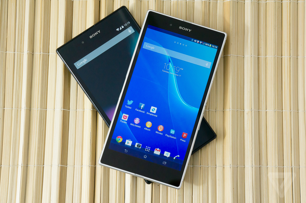
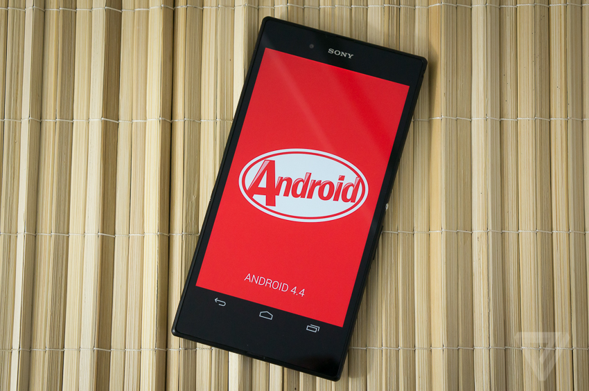
If you’re looking for the biggest smartphone you can get, without regard for portability and price, then you needn’t look any further than the Sony Z Ultra. Available in two flavors, one with Sony’s custom Xperia branding, apps, and services, and another straight from Google with an unmolested version of Android, the Z Ultra is the current reigning champ in the neverending smartphone size wars.
These identical twins, separated at birth and raised by different parents at opposite ends of the world, look similar on the outside and have essentially the same makeup on the inside. But they can’t escape their upbringings, and Sony’s Xperia Z Ultra offers quite a different experience than the Google Play Edition Z Ultra.
We’ve heard this story before: the Google Play Editions of the Samsung Galaxy S4 and HTC One hit the market this past summer, providing a very Google-y counterpart to their manufacturer’s interpretation of Android. But while the normal versions of the Galaxy S4 and One are mainstream smartphones that can be purchased on-contract from every major carrier, the Google Play Editions are only available unlocked, without subsidies, directly from Google itself.
The Z Ultra is a bit different. Either version is a niche product, a 6.4-inch behemoth of a "phone" that isn’t sold by any carrier and can only be ordered unlocked from Sony or Google for $679.99 or $649.99, respectively. These aren’t phones for the mainstream, moms and dads that go into their local carrier stores looking to get the best deal on three lines of service and whatever iPhone or popular Android phone goes with it. Nor are they for the person that just wants a bigger phone — the Samsung Galaxy Note 3 is a better choice for that and can easily be bought in carrier stores. These are for the enthusiast that doesn’t mind paying full retail price for a phone and ordering it warts and all unseen from an internet retailer.
If you’ve already declared yourself part of that niche, and are aware of what you’re getting into when you decide to carry around a phone with a screen larger than virtually anything else out there, which twin do you go with? Sony was responsible for the hardware design decisions and its Xperia software more or less complements them. But Google’s Android is preferred by many over manufacturer skins and interfaces, and the Google Play Edition Z Ultra comes with the most up-to-date Android you can get (along with the understanding that updates will come swiftly).
I’ve spent the past few days with both devices and you might be surprised which one is actually the better smartphone.
<a class=
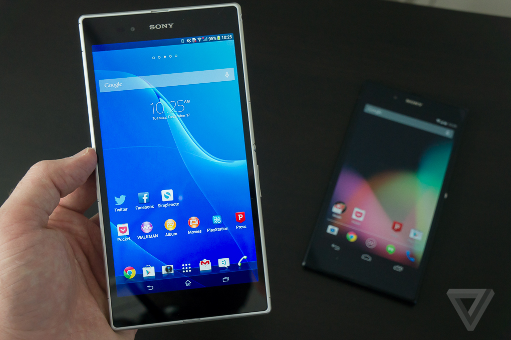
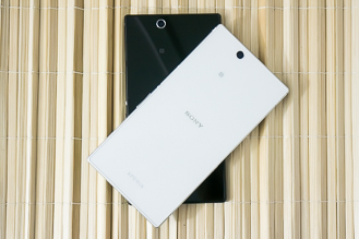
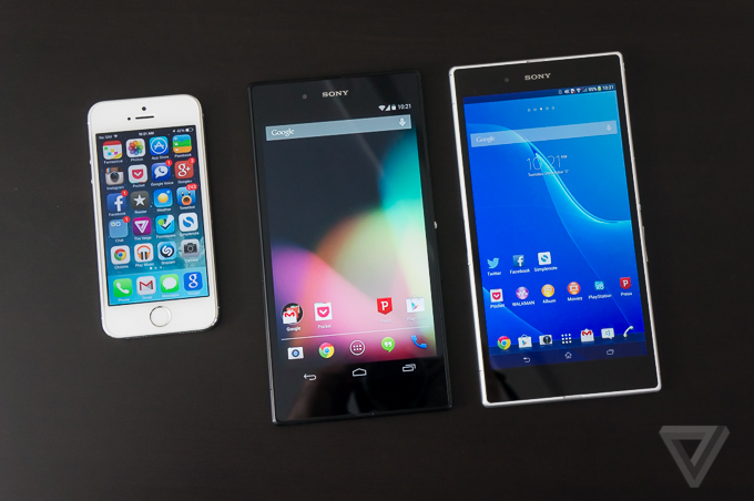
The defining thing about the Z Ultra is its massive size, whether it’s the Xperia version or the Google Play Edition. It’s so big it makes other genuinely big phones, such as the HTC One and Samsung Galaxy S4, look tiny in comparison.
Sonyzultra-329-1Sonyzultra-329-2Sonyzultra-329-10
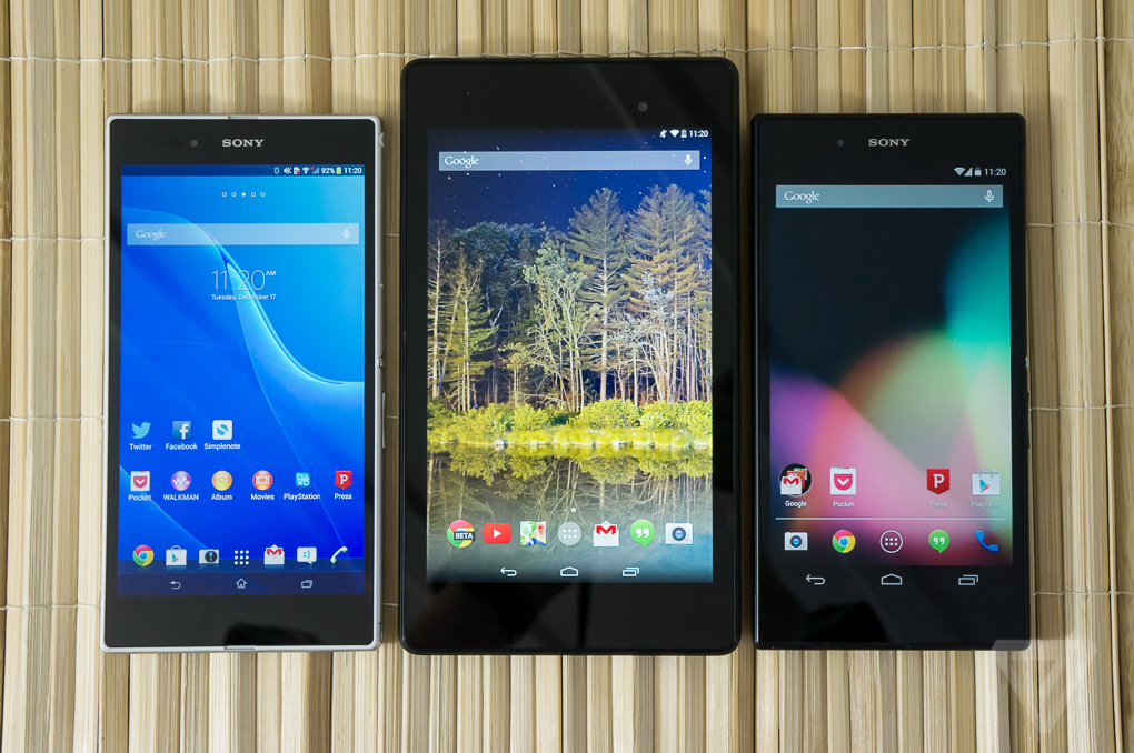
The Z Ultra’s 1080p 6.4-inch display (that’s only 0.6 inches smaller than a bona fide tablet like the Nexus 7, mind you) is pixel dense and bright and doesn’t have the poor viewing angles that other Sony displays exhibit. It’s a pleasant screen to look at whether I am reading books, watching video, or just noodling around on Twitter. But that screen comes at a price: at 7.04 x 3.62 inches in size and nearly 7.5 ounces in weight, the phone is just so incredibly big. Despite the gargantuan proportions, Sony insists on calling the Z Ultra a "phone" and expects you to use it as such. (As you might guess, it’s not very comfortable to talk on.)
I can’t fit either Z Ultra in the front or back pockets of my pants, so I pretty much have to carry it around in my bag or in a jacket pocket. That’s something I’m accustomed to with tablets (and I don’t mind it so much there), but I check my phone on the go far more often than I look at a tablet and it’s annoying to have to dig it out of my bag or jacket to do so. I ended up checking my phone less as a result (which might be a good thing), but I like to be on top of things as possible, and ease of access to my phone is paramount.
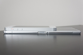
The Z Ultra is almost inconceivably thin — at 0.26 inches thick it’s thinner than even the diminutive iPhone 5S. But that doesn’t make it any easier to fit in my pocket and it’s actuallymore awkward and uncomfortable to use. The phone is massive, but there’s actually very little to hold on to when you’re using it, so I frequently touched the screen by mistake when picking it up. It also can be easily flexed — if you do manage to fit it in your pocket, you’re going to want to be careful where and how you sit down.
The Xperia version comes in either white, black, or a very Prince-like purple, while the Google Play Edition stays with a conservative black. I like the look of the white model, but the sleek black of my Google Play Edition review unit almost tricks me into thinking the phone is smaller than it actually is. The glass backs pick up my fingerprints pretty easily and are much more slippery than a soft-touch finish, much like the iPhone 4 and 4S. All colors feature silver accents on the power button and camera surround that are similar to Sony’s other recent smartphones. They are also water resistant, so feel free to take them swimming, in the shower, bathing, or whatever else it is you do with a waterproof phone.
Sonyxperiazultra-680-12
Under its glass-and-metal frame, the Z Ultra is impressive: it has a 2.2GHz Snapdragon 800 processor, 2GB of RAM, 16GB of internal storage with a slot for Micro SD cards, and support for AT&T and T-Mobile’s LTE networks. That’s the same powerful processor used in the Nexus 5 and other recent devices, and it’s just as fast here, regardless of whether it’s pushing around Sony’s or Google’s software. Sony’s 8-megapixel camera is a bit more of a disappointment, however, producing washed-out images with a lot of noise and grain. Both phones have large 3,000mAh batteries, but that big display takes its toll — I only saw battery life of about 14–15 hours from either device. These aren’t multi-day warriors like the Samsung Galaxy Note 3 or LG G2.

Sonyxperiazultra-1020-21
Sony’s version of the Z Ultra, the one that wears the Xperia logo proudly, runs Android 4.2.2 Jelly Bean with Sony’s custom interface and apps. It’s the same interface Sony has used on the Xperia Z and other flagship phones, and it’s got a lot of flashy animations and light textures where standard Android is usually reserved and dark. It’s not an unattractive interface by any means, and it puts the more garish interfaces made by LG and Samsung to shame, but it’s not as stark and utilitarian as Google’s Android.
Conversely, the Google Edition of the Z Ultra has no such branding and runs Android 4.4.2 KitKat the way Google intended it, without any added apps or services or features. It’s essentially the same software that Google offers on the Nexus 4 and Nexus 5 (but without the Nexus 5’s exclusive app launcher). It’s a blown-up version of KitKat, but trust me when I say this, it’s the exact same experience, just bigger. Google didn’t really do anything to take advantage of the massive screen real estate offered by the Z Ultra, so all of the apps, menus, settings, toggles, icons, etc. look the same on the Ultra as they do on the Nexus 5. Granted, the text is larger, but you don’t get to see any more information than if you were looking at the Nexus 5’s much smaller 5-inch display.
Sonyzultra-850-7
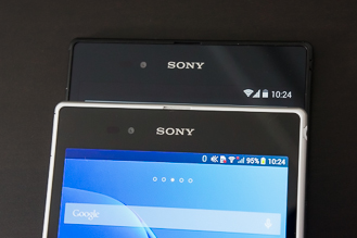
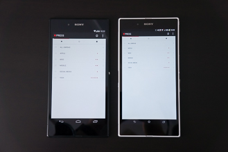
Sony takes a different approach with its software. Everything is smaller on the Xperia phone compared to the Google Play Edition: the icons, the menu, the status bar, the fonts. It requires me to actually squint to read some things, which is inconvenient and uncomfortable, but it is possible to see more information on the Xperia’s display than on Google’s version. The app icons on the home screen are actually smaller than the app icons on an iPhone 5S, even though the Z Ultra’s screen is 60 percent larger. That doesn’t help you fit any more icons on a page either, since the Z’s app launcher only displays 30 at a time. Still, it feels like a more efficient use of the Ultra’s hardware than the Google Edition.
Sonyzultra-329-17Sonyzultra-329-14
Though the Xperia doesn’t run tablet software, certain apps behave like tablet apps on it and take advantage of its big screen with better layouts and interfaces. Not all apps do this — it seems to be hit or miss when they do (my favorite RSS reader app Press doesn’t, but the Google Play Store and Pocket do, for instance) — but it is nice to see that there is at least some effort made to take advantage of the hardware. Sony doesn’t provide a stylus akin to the Samsung Galaxy Note devices, but it does have an option in its keyboard to convert handwriting to text and you can use any ordinary pen or pencil to write on the Xperia’s display. It’s not the same as the special software offered by the Galaxy Note 3 for stylus work, but it’s a neat little trick.
Sony’s version also has a set of mini apps, such as a calculator, notepad, and others, that "float" on top of other apps for multitasking. It’s a trick we’ve seen before, even on Sony’s own devices, and normally I find the apps to be gimmicky and not very useful. But on the Z Ultra’s expansive display, it almost makes sense to have them. I really wish Sony had included a stylus and optimized software for it on the Ultra, however. This device is just begging for it.
The Xperia model also has a much better camera app than the Google Edition (though neither version takes great photos), a custom power management system, and a few duplicated media apps that Sony jams down your throat when you turn it on, such as Sony’s own Walkman music player and e-book reader. The Xperia also has Sony’s PlayStation Mobile portal, but it’s not much better than Google’s own Play Store for gaming options.
I don’t often say this, but in the case of the Sony Z Ultra, Sony’s interface and software on the Xperia version offer a better experience than the bone-stock Android of the Google Play Edition. The Google Play model may be more up to date with the latest version of Android, and it will likely see updates to the next versions of Android well before the Xperia model. But Sony has committed to updating its devices pretty regularly (it just started shipping Android 4.3 for the international Xperia Z Ultra, and it should soon be available for the US model), and it has a pretty good track record for doing so.

SOURCE:: The Verge

Snapchat releases big new update with visual filters, Replay feature, and more.....


snapchat stories 2 (ellis)


By:: Casey Newton

Snapchat released a significant update to its iOS app today that includes support for a range of new services, including swipeable photo filters. An update to the app reveals support for a range of filters, including "smart filters" that include the current time, temperature, and even how fast you're moving. "We just decided as a holiday present to the Snapchat community that we would put out a couple things we thought were fun," Snapchat CEO Evan Spiegel said in an interview with The Verge.


To enable the new features, you have to go to the app's setting menu and scroll to Additional Services. Tap 'manage' and you'll see six new settings, including visual filters and 'smart' filters. Once you've enabled them, take a snap and wait for the image to appear. From there, swipe left and right and Snapchat will apply various filters. One filter will overlay the current temperature on your picture, using data supplied by the Weather Channel. Another will overlay your speed. ("Don't snap and drive," Spiegel says.)
But the most interesting feature here may be Replay, an option that lets you watch one snap per day for a second time. Did you miss part of a friend's message because you didn't realize it was a video snap that included audio? You can now watch it one more time. The message is still deleted from Snapchat's servers after the first play, Spiegel says. But after countless moments of missing friends' snaps, he said, his team wanted to enable people to get a second chance. "You only get one a day, so you've got to use it where it counts," Spiegel says.
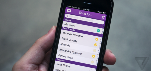
The update also gives you another option for the font on your text, if you like to caption your photos. You can enable a front-facing flash for your selfies. And you can specify how many of your friends you want to appear in your 'best friends' menu, up to seven. Spiegel says today's release is an intermediate step for the company — "we're basically in between big update cycles," he says. But for fans of the app, today's update is likely to feel pretty big in its own right.
SOURCE:: The Verge

Online advertising could ruin Christmas by spoiling gift ideas

present (SHUTTERSTOCK)
Present from Shutterstock

BY ::  Jacob Kastrenakes 
You'll want to be careful with how you shop online for the holidays, or retailers could end up spoiling your gifts. Through a type of ad tracking called "ad retargeting," retailers can remember what products you've bought and browsed on their websites, and then advertise them back to you across the web. At Marketing Land, Danny Sullivan writes about how ad retargeting nearly spoiled his wife's holiday purchases this year. Items that she looked at on Macy's and ThinkGeek kept turning up in banner ads — a big problem since their children shared the computer.
Unfortunately, opting out isn't always possible. Marketing Land reports that while some ads allow it, for others, the only way to hide a product is to start browsing the advertiser's website again until it promotes a different set of products. Gift buyers can get around it in the first place by doing their shopping through a private browsing mode or a personal account on a shared computer — but if they don't, family may be left wondering why their gifts look so familiar this year.
SOURCE:: THE VERGE

Websites Resources | Blogging | Technology News | Softwares - i Developments